

APPLICATION
Logo: Clear Space & Spacing
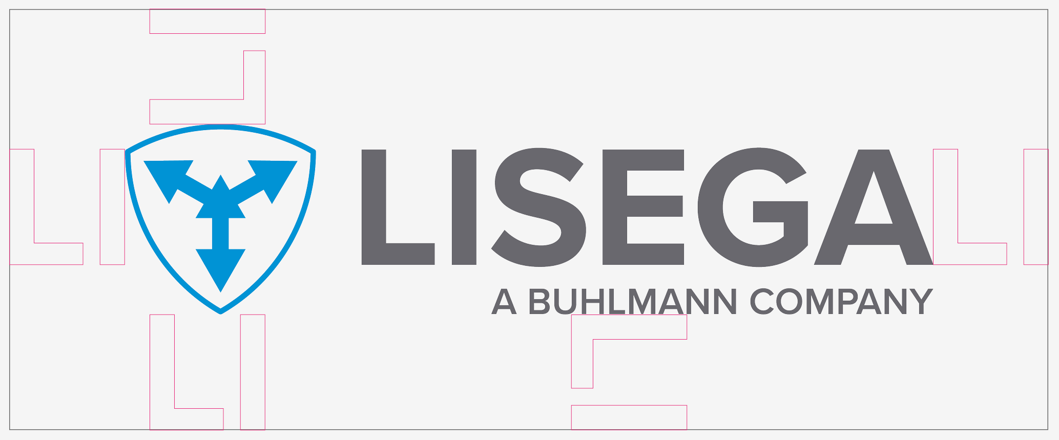
The clear space – the minimum distance between the logo and the edge – is based on the x-height of the wordmark. The “LI” element forms an almost perfect square (99.9%) and can therefore be used to define the required spacing, even when rotated. The logo should always be left-aligned. Right alignment is only permitted in exceptional cases.
DON’TS

Outlined logo
Vertical orientation
Rotated logo
Figurative mark behind the word mark
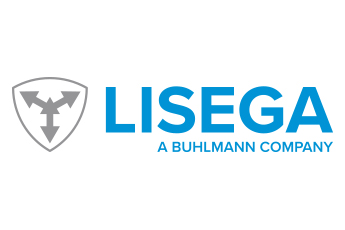
Reversed colour
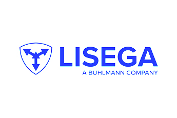
Unapproved colour
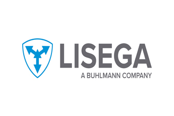
Distorted or warped logo
Low-resolution
As a general rule, the wordmark and logo symbol should not be separated. If separation is necessary – for example, on particularly small promotional items – a clear relationship between the two elements must be maintained.
Example: On a ballpoint pen, the logo symbol may be placed on the push button, while the wordmark appears on the barrel or clip.