
TYPOGRAPHY
TYPOGRAPHY IN DESIGN
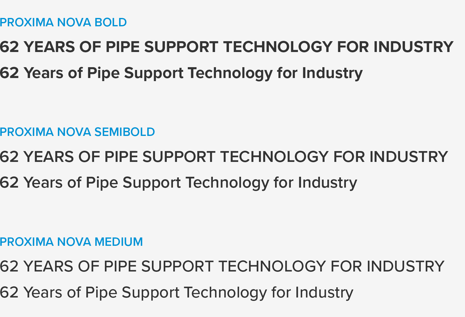
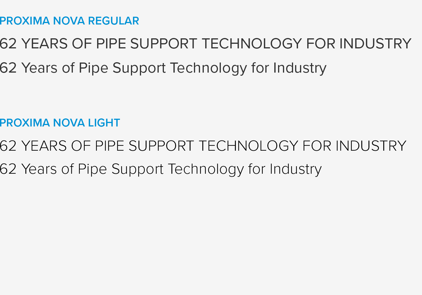
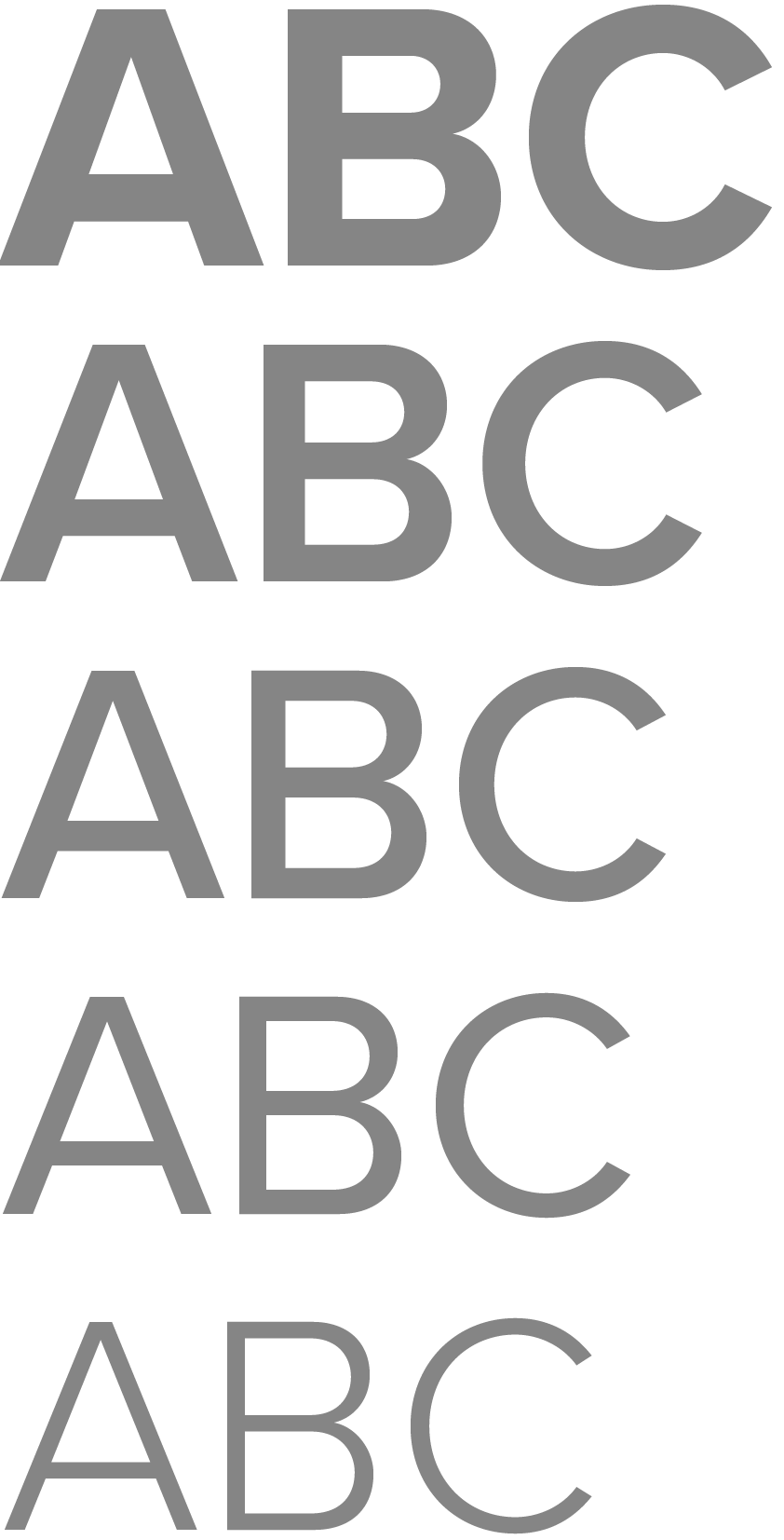
Proxima Nova Regular, Semibold and Bold are the primary font weights used in layouts. Other weights, such as Medium and Light, may be added where typographically necessary – for example, in magazines and brochures, introductory texts or page labels.
Fully justified text should only be used in exceptional cases and must always be professionally typeset.
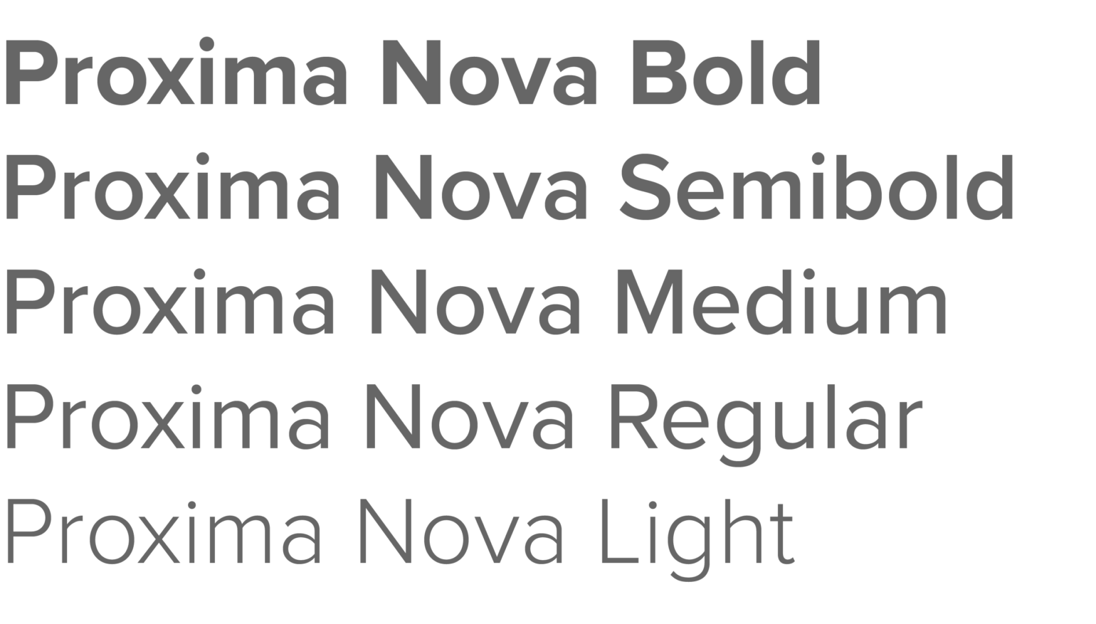
Proxima Nova is primarily used for print and digital media, merchandise and other official applications. It is available through Adobe Creative Cloud. With its understated, professional and approachable character, the typeface reflects LISEGA’s brand values while meeting international design standards. It supports Latin, Greek and Cyrillic scripts.
Proxima Nova Condensed styles are intended for applications where space is limited – for example, long personal names on business cards or text in tables. Their use should remain the exception.

HEADLINES
SUBHEADLINE
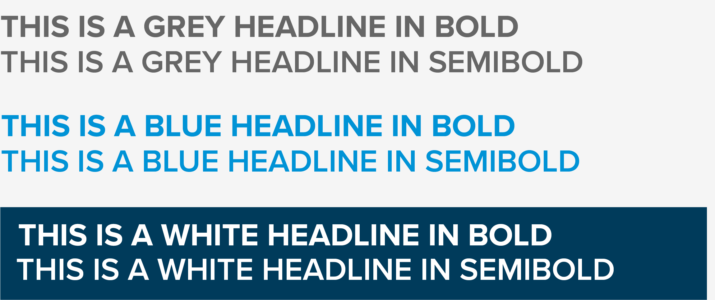
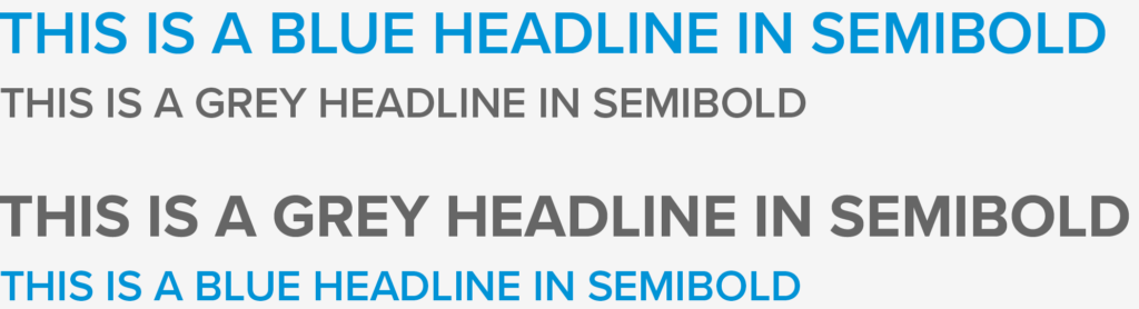
If the headline is grey, the subheading is blue – and vice versa. The subheading must never be set in a heavier font weight than the headline.
HEADLINES
-
Set headlines in Proxima Nova Bold or Semibold, depending on the required contrast and size. Use uppercase and combine LISEGA Grey with LISEGA Blue – or vice versa. Use white on dark backgrounds.
-
There is no fixed font size – it should always be adapted to the medium.
-
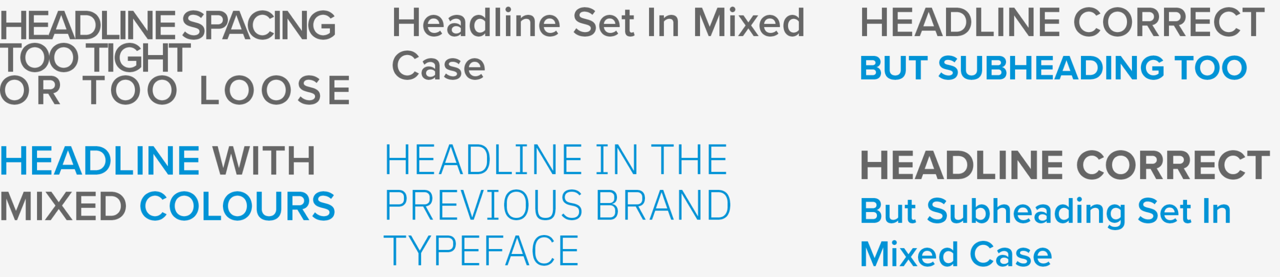
Do not alter the letter spacing.
-
Line spacing should be between 140% and 160% of the font size – equivalent to a ratio of 1.4 to 1.6.
-
Set subheadings in Proxima Nova Semibold, in either LISEGA Grey or LISEGA Blue, and in uppercase.
-
Headlines should be significantly larger than subheadings.
-
Set overlines in Proxima Nova Semibold, in either LISEGA Blue or LISEGA Grey, and in uppercase. They should be smaller than the subheading.
-
Do not mix colours within a headline. Do not use shadows, outlines or other effects – see Logo › Application.
BODY COPY
- Set body copy in Proxima Nova Regular or Light — or Medium where appropriate — using LISEGA Grey or 80% black. Using 80% black instead of LISEGA Grey creates a neutral grey and helps prevent blurred edges in print.
- Emphasis within body copy should always use the same text colour and be set in uppercase — never in bold, for example: LISEGA.
HEADLINE DONʼTS
TYPOGRAPHY FOR EVERYDAY BUSINESS USE:
FALLBACK FONT: ARIAL
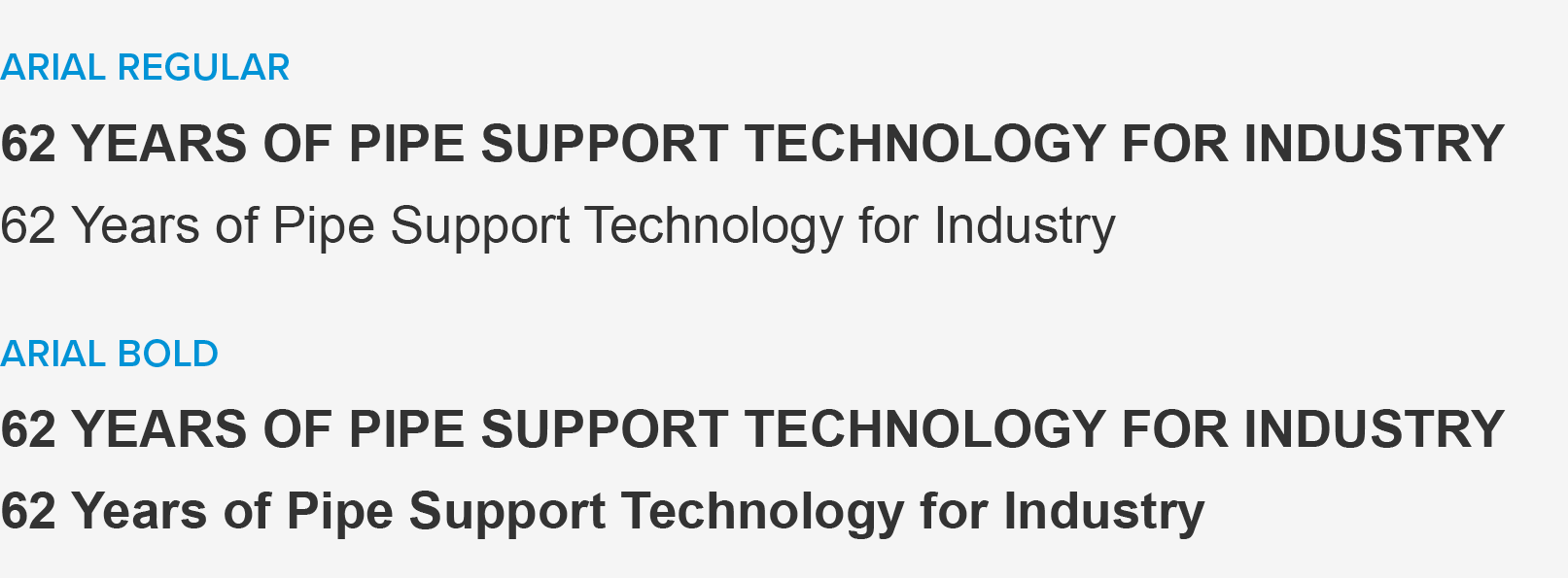
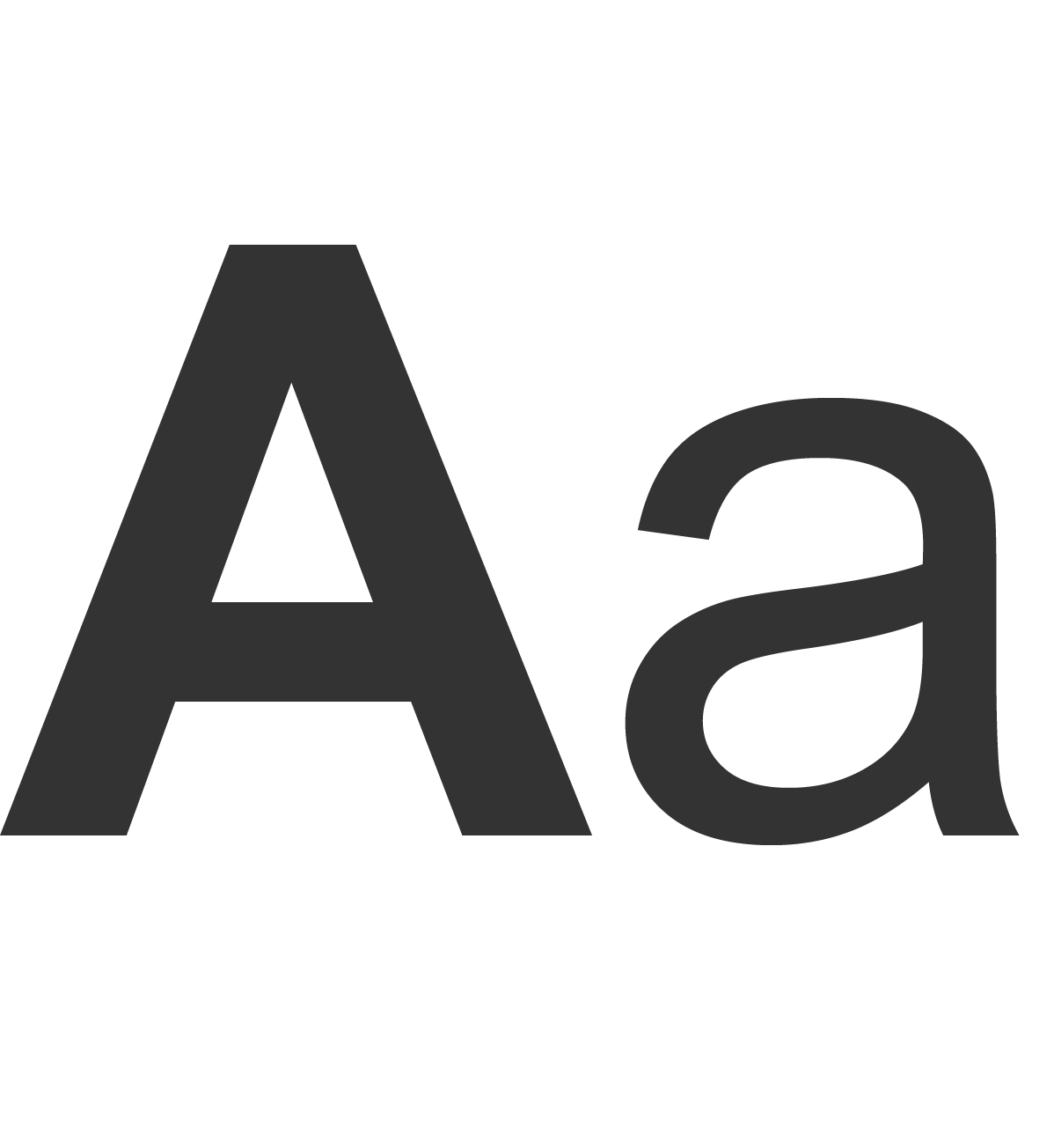
No additional fonts need to be installed for everyday business use – including emails, letters, forms and Office applications. Arial, which is available as a system font, should be used for these purposes.
Always use the latest templates and do not make substantial changes to them. Font sizes, line spacing and colours are predefined in forms across all Office applications. For practical reasons, the font colour is set to 100% black.